
The client is a real estate agency trying to find its place in New York City. The objective is to analyse the New York City rental market to identify trends and insights that can inform both renters and property owners.
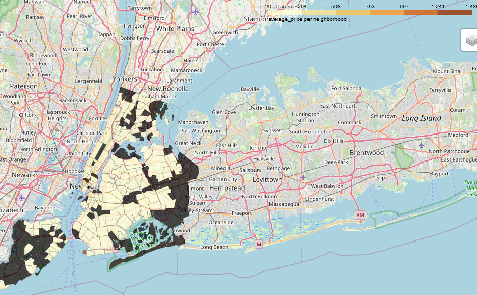
This map shows the overview of average price per neighbourhood of new York City. The area with ‘black map’ are areas not represented in the in the map. From the Map, it is quite clear that most rental accommodation are below $300.
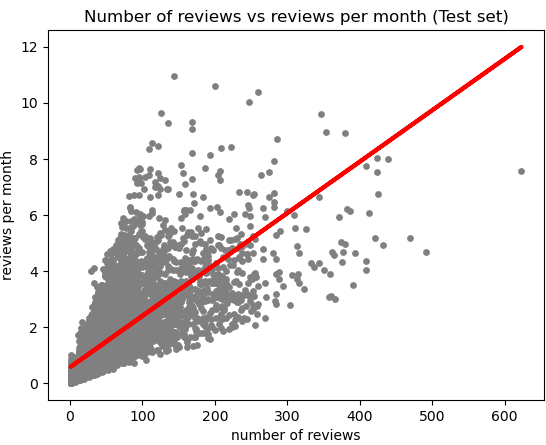
From this chart, we were able to generate our hypothesis “does the review per month increase when the number of reviews increases. Is it a contributing factor to high occupancy rate. Another round of testing was conducted to find whether there’s a strong correlation with this hypothesis
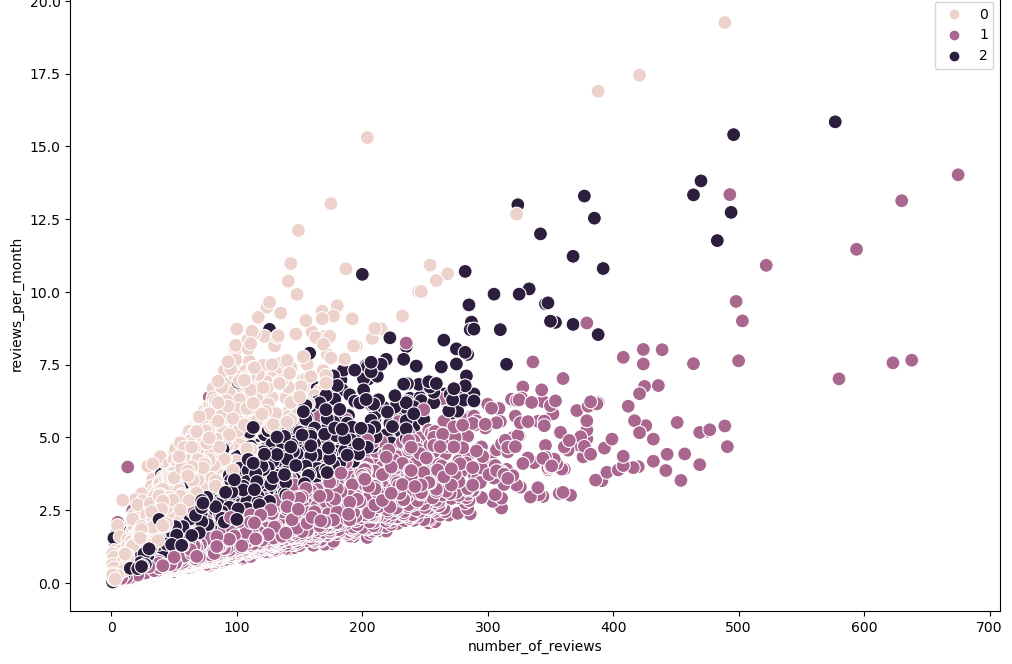
The chart shows three groups of rental listings by review activity. The lightest cluster has few reviews, suggesting newer or less popular properties. The middle (1) cluster indicates moderate review activity, and the darkest cluster includes highly reviewed, likely popular listings. Overlaps and outliers suggest varying popularity and listing age.
When pricing rental properties in New York City Neighbourhood, the following should be considered; Popular properties, as indicated by the number of reviews, might not always be the most expensive, suggesting that factors other than price drive demand.